Thursday, 30 December 2010

Evaluation

In what ways does your media product use, develop or challenge forms and conventions of real media products?


How effective is the combination of your main product and ancillary tasks?


What have you learned from your audience feedback?

My audience have not only given me feedback for my music video showcasing, but they also gave me feedback for my music video pitch which I did just before I filmed and long before I had edited the music video into the final for what it is now.

Here are some of the ideas which helped me to achieve a better music video for my audience:

  • Colourisation - I used this for some of the shots, just to enhance the colours because they seemed to be a bit dull. This also included some of the effects I used such as the 'Dreamy' effect in the chorus, which corresponded to the lyrics.
  • Star Image Motif - I used the cardboard box idea and Jack In The Box idea as a star image motif idea which I also used on my website and my CD digipak.
  • Fast animation of the band in the chorus - In a way I did do this, although I didn't do it in the chorus because I had packed a load of other footage into both chorus' so I thought I would speed up some of the band members and put them in various parts of the video.
Here is my audience feedback which I got back from my showcasing. I have also included what I agree and disagree with and commented on the comments I got:

Click to enlarge.


How did you use new media techniques in the construction and research, planning and evaluation stages?

Throughout my editing, filming and ancillary task stages, I have been using a blog (which is what this post appears on) as an online diary. On here I have showed what decisions I have made, what problems I have discovered and over come. Previous to all of these posts, I posted all my planning stages and music video, website and digipak theories to help me decided how I wanted to make and develop my project.
Before I started to film my video - while I was still in the planning stages - I posted my location shots, initial ideas and my music video pitch (video clip).
Within my blog I have embedded videos from YouTube, pictures, power point slideshows and MP3's, these have enabled me to make my responses more creative and to help show my thoughts and ideas better.

During the filming stages of my music video, I used a HD video camera to achieve the highest quality with the least amount of grain. I though the camera itself would also be better for the lighting of the environment, because when I used the mini DV cameras the bright lighting made the quality more grainy and a bit pixelated.
Panasonic HDC-SD60 Full HD


Panasonic Lumix FZ35
Along with using a video camera, I have also used a stills camera. I used a compact bridge camera for my stop frame animation shots and for my photoshoot of the band, I borrowed an SLR camera because it was able to fit a flashgun (external flash) on to the top. I needed this because I was shooting at night and the flash on my camera wasn't strong enough.
I also used a tripod, for both the stop frame animation and for the photoshoot. I needed it for the stop frame animation because the camera needed to be kept in the same stable place the whole time, so that when I managed to the photos together in the editing stage, they would flow together and not jolt about.
Nikon D60
I used the tripod for the band photoshoot, because it was done at night. This meant I needed to put the camera on manual mode and change the aperture and shutter speed to get the correct exposure. This meant it needed to be stable because the shutter would have needed to be open longer to get more light in. Also, because I was in the band there was no one to hold the camera whilst we were in the frame, so a tripod was the best option all round.

During the filming stages of my music video, I mainly used the same lighting throughout. I used overhead filtered lights which were on tripods for the performance parts, which I used the flashing setting, where it flashed along to the beats on the song, which was very helpful because I couldn't have done that whilst playing. I also used the lights which were on the ceiling, but they only added a little bit of light, because I wanted the it to be slightly dark in the warehouse so it had the effect of being midnight.
Similar lighting to what I used
In the shot for the 'A jack in the box, a doll and a teddy bear', I used the light on the video camera because it was brighter and gave a better effect of what the focus was on. For the remaining parts, excluding the toys coming out of the bass drum and the jack in the box popping up at the end, I used the white light setting on the overhead filtered lights, because these shots were happening in a different part of the warehouse and I thought it would split the sections up a little bit so the colour didn't overpower the video.
The toys coming out of the bass drum had very simple to achieve lighting, I positioned my stills camera on a tripod in front of the bass drum, making sure the reflection of the camera couldn't be seen in the bass drum skin. I used four different coloured filters and put one colour on for each shot. It worked well, because it fitted in with the performance by using the same colours.
Lastly, the jack in the box popping up shot (which was right at the end) had white light, but also had a faint green light as well, this gave a more dynamic/3D effect of the boxes behind when the shadow appeared. The shadow had a thin green outline around it.

'Dream' effect
'Vignette' effect
To edit my music video, I used iMovie on a Apple Mac. This is a basic editing package which comes pre-installed but it still can create brilliant effects for what I needed. I used only a few effects on individual shots, because quite a few were similar. The effects that I did use were 'Dream', 'Flipped' and 'Vignette'. The 'Dream' effect made the shot a bit lighter but also softened the tones and outlines, which I used in the chorus section where the words are 'trick of the light.' The 'Flipped' effect just flips the shot round, I used this when I positioned the camera behind the band and it flipped on the beat. The 'Vignette' effect adds a rounded black frame around the shot which fades into the middle, it was a good effect to use when I wanted the focus on the main subject in the frame. I also used colourisation on some of the shots to make them darker or to make the colours deeper.
'Flipped' effect
My music video had lip syncing in it, so to get this all in time I used the 'precision editor' within iMovie, this was also useful to get the other instruments in time as well, especially the drums.

'GIMP' logo
Desktop publishing software was used during the website design and the digipak design. I used a free image manipulation program called 'GIMP' to create a cardboard-like design for both my ancillary tasks and this was a typical theme in my whole project. Also on this program I created the band logo, album name design, information to go on the back and spine of the digipak and the tracklist, the buttons for the website, news feed, adverts which are animated on the right side of the page and animated jack in the boxes with band members heads on them.
'Lightroom 3' Logo
Additionally, I did a band photoshoot where I took numerous amounts of pictures of the band together and just the members on their own. I picked the most successful ones and edited them using another program - this time not free - called 'Adobe Photoshop Lightroom 3'. I manipulated these images so they were mainly black and white, but the graffiti on the wall behind was bright and crisp. I opened these manipulated files up in 'GIMP' and made a paper crumpled effect which when I scattered them over the inside of my digipak and the bottom of my website, it gave the effect of the photos being stuck onto the side of a box.

Once I had made all the components for my website, I used a program called 'Serif Page Plus' to make it take the form of a website and from here, I would upload it.
The components I used were:

  • Cardboard background
  • Opaque overlay
  • News feed
  • Adverts
  • External social icons
  • Internal buttons
  • Band logo
  • Band member jack in the boxes
  • Photoshoot pictures
In 'Serif Page Plus', I uploaded each of these components separately and then arranged them how I wanted them. To arrange them how I did, I looked at other websites and found that the news feeds were either in the middle or on the left. This is because the audience read left to right and it makes sense to have it this way. After I had done all of the arranging, I exported the website as a HTML and then uploaded it to a free hosting site called 'Angelcities'.

Friday, 17 December 2010

Final Website

Here is my final website the band Kids With Fireworks.

Depending on the size of the screen depends on how wide the website looks.
It can be accessed here - http://www.kidswithfireworks.angelcities.com/
As you can see, I have uploaded it through a free hosting site called 'Angel Cities', I did this because it was a free option and I was unable to upload it to the server I was hoping to.
Unfortunately the hosting site an advert in the top left hand corner with a search bar and links across the top, but I knew this before I signed up for it. They have this because it is only a free hosting site and one of the only ways they can make money is buy 'browsers' clicking on these links.

Other than that, I am really happy with the design of my website.

Final Digipak

Here is my final digipak design for the album 'Jack In The Box' by Kids With Fireworks.

Front and Back
(the lines in the middle wouldn't usually be there,
 but it is to determine where the spine is)

Inside
(the lines in the middle wouldn't usually be there,
 but it is to determine where the spine is) 

Thursday, 9 December 2010

Final Music Video

Here is my final music video for the song 'Jack In The Box' by Kids With Fireworks.

Wednesday, 17 November 2010

Designing My Digipak

I decided to go with my second draft for my album cover which was the cardboard theme as the background and stickers on the front and back for band logo, album name, tracklist, copyright information and contact websites. I decided to go with this idea because I thought it looked really effective and also looked a lot more professional than my original idea of the bokeh lights.

I have finished designing the digipak and here are the steps that I took to do it:

Outside:
Cardboard Background:
  1. First I measured the size of another digipak that I owned and made the canvas on the image manipulation software this size. This was only for the front and back, and then I copyed the file so this could now be inside A and inside B. (The next steps will be for both copies)
  2. Next I made another layer and measured the middle where the spine was going to be, I drew two lines downwards as a guide so I knew where to stop for the middle section. I left this layer as a transparent layer and had it on all the time. When I come to finalising my digipak I'll save one with these guides and one without.
  3. On the background layer, I filled it with a yellow/light brown colour which looks similar to cardboard - let's call it 'the cardboard colour'.
  4. I then used a distorted filter called 'newsprint', then another distorted filter called 'emboss' and finally the last distorted filter called ' wind'. I set the layer mode to multiply.
  5. I added a new transparent layer and filled it with the cardboard colour and added a noise filter called 'HSV noise' and then 'gaussian blur'. These gave the corrugated effect of the cardboard.
  6. I added another new transparent layer and filled it with the cardboard colour, I don't do anything with this layer yet. So I make another transparent layer and use a render filter called 'clouds > plasma'.
  7. Now I desaturate the layer (so it turns black and white) and set the layer mode to overlay. I merge this layer down to the untouched cardboard coloured layer.
  8. Next I use a map filter called 'bump map' which gives a little texture to this layer and then reduce the opacity to let the corrugated card seep through a little.
  9. I switched to the top layer and add a layer mask to remove the edges of the canvas to look like it has been slightly damaged and it also adds some depth to the cardboard design - I used grunge type brushed for this which erased the areas.
  10. Next I clicked apply layer mask, which applied the erased areas to the canvas.
  11. The last step I did was to apply the drop shadow to enhance the depth.
The lines in the centre are the guide to show the spine.
28.6cm x 12.9cm
Spine - 0.5cm x 12.9cm
Album Name/Other Text Objects:
  1. I made a new size canvas which was a bigish size so it would fit it on clearly. I measured it against another album cover to see how it would fit.
  2. I deleted the background layer and added a new layer which was now a light yellow.
  3. I took a picture of a crumpled piece of paper and opened it as a layer, moved it around to get the best crumpled part and then lowered the opacity to about 15%. This meant that the yellow could be seen but still had a few creases. I merged the layers down.
  4. Next I used the text tool and my selected font - which was 'Arial Rounded MT Bold' - and typed the name of my album onto the layer - 'Jack In The Box'. I then deselected this layer and selected the creased yellow layer, using the lasso tool, I drew around the layer and made it look torn/ripped.
  5. I then merged the text layer down and used a drop shadow effect to make it look like it had a bit of depth.
  6. I now saved this filed a '.png' so that it could be added to my album cover with a transparent background and then added it as a new layer on my CD cover.
  7. I used this method for the album name, copyright information, recording information detail on spine and website addresses.
Album name - middle

Band Logo:
  1. First I made a new canvas with a transparent background and chose a font called 'Fairly Odd Font'. I typed out 'Kids' on one layer and 'With Fireworks' on another layer.
  2. I selected the 'Kids' layer and using the elliptical select tool I drew around the word, making it slightly spacey.
  3. I created a new transparent layer under the 'Kids' layer and filled it with a white background - this fills the circle around the word.
  4. Now select the 'With Fireworks' layer and select alpha to selection and then click grow so that a dotted line comes around the words which is also spacey.
  5. Create another new transparent later under the 'With Fireworks' text layer and fill with white background colour, this will fill colour within the dotted line.
  6. Move the new layers of white fills below the text layers and merge them down.
  7. Select the newly merged layer and do alpha to selection to highlight it all, now using the free select tool (Intersect Mode) and I drew around a few of the sides of them and then added a grey to white gradient to it to make it look like the logo is peeling off. I did this to a few of the corners.
  8. Next I merged down the layer and added a drop shadow effect to it, to add some depth to the logo.
  9. Now I merged all the layers down and saved it as a '.png' file and added it as a new layer to my CD cover.
Bottom right hand corner

That was the front of the digipak finished - and some of the back - but the next stage was to do the tracklist. First I did it in the same style as the other text objects so it looked like a piece of paper stuck onto the box, but it filled too much room on it and was a bit of an awkward size. To get round this, I thought it would look better if it had just text on the cardboard background. I downloaded a 'biro' font, so that it would look like it had been written on to the box, and the I re-typed out the set list and saved it as a '.png' file, to import it to the digipak.
Here is what it looked like:


I thought about adding a photograph to my album cover, but I decided that adding photographs to it would detract from the whole point of the design. The title of the song is 'Jack In The Box' and this is the 'box' in which the 'Jack' is. The cardboard effect is taken from my video which features many cardboard boxes and I wanted a simple uncluttered representation which tied in to my music video.

I have looked a various examples of artists who haven't used photographs on their album covers. Here are some of them:


Pink Floyd - Dark Side of The Moon

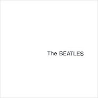
The Beatles - The White Album
Hard Fi - Once Upon A Time In The West

Beck - The Information
I didn't feel a photograph would fit into the colour scheme either, the colour scheme which I have used - across all 4 of the sides - is black, white, browny/yellow (cardboard colour) and red. These are the similar colours which I have used in my music video, although to make it more lively I have used coloured flashing lights because I wanted to add depth to the music video, I also wanted it to make the music video more colourful as it is about toys - which come in a range of different colours. I have purposely gone over the rule of using three house colours because although the rule is to keep the cd design uncluttered, it would add more colour to my basic, simplistic design. I have kept to the three colours on the front and back of the album, but I have added an extra colour inside, which is red. I have done this because I needed an extra colour for a Jack In The Box, in which the heads of the band members are placed.
I have used photography for this bit, because when I looked inside of many albums (digipaks) of a similar genre to my own they have included pictures of the band. A simple picture of the band wouldn't fit with the cardboard background effect of my cover, so this is why I decided to use the band's heads as the 'Jack' in the 'box'.
Additionally I used red for a stamp - similar to the one below on the 'Capt. Beefheart' album, but it said 'Fragile Handle With Care'. This is placed on Side B, under where the CD goes and is to not only add a bit of colour on to the side of the digipak, but to also add another element to make it look even more so like a cardboard box.

I have found this CD cover and I am hoping that mine will turn out something similar to this:

Capt. Beefheart & His Magic Band - Strictly Personal


Looking at the albums that I posted above they have a very basic range of texts and are mostly similar on them all. When I was making my album and choosing the fonts, I looked at a variety of albums and they have a very basic amount of texts, one of them that I looked into a lot was Muse - Resistance and this had only two recogniseable fonts across the cover, back and inside. I wasn't that surprised about this because most band have tended to have a low amount of fonts. If too many fonts are used it can make the album get fairly confusing.
The album just above - 'Capt. Beefheart' - has two recognising fonts, these being the blue handwritten font and the red stamp font. Although one stamp font has a box around it, it is the same as the other two which don't have a ring around them.


-------------------------------------------------------------------------------------------------------------
Inside:
I re-looked at other artists CD covers to see if they had put photos of the band anywhere apart from on the front cover, and I found that some of them had and some of them haven't. I thought that I would try it out and see what it looked like. I actually thought that it looked better than just having a 'Fragile' sign on the inside of the digipak. I have also decided that the cover will now be a slipcase design instead of the CD disc fitting on a plastic tray inside - the disc will fit into a pocket sort of design.

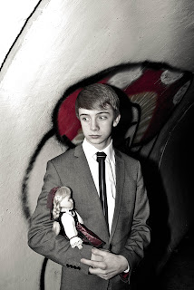
These are the photographs that I took to use in on my CD cover:


To make these photos look like this I had to desaturate the colours and then make the background - where the red graffiti is - a bold red colour so that it stands out on all the photos. Next I added a slight yellowy tint to make them look slightly vintage/retro. To achieve these photos, I used a DSLR camera, tripod and a flashgun. From the start, the flashgun already gave the image a bold colour, but it was too bright for my CD cover - so this is why I toned it all down a bit.
Here are the final edited photos that I used on my CD cover:


Next, I made these photos fit on to my CD cover a bit better by opening them up in 'GIMP' and then adding a white border, this made them look a little bit like a polaroid photo, although I didn't want a big border, which would detract from the image. I now added a paper layer, which is the same piece of crumpled paper I used on my CD cover to create the boxes of text, I enlarged the size because originally it was too small to fit the photo and then lowered the opacity of the paper layer. I merged all of the layers down and then added a yellowy/orangey/browny layer which I lowered the opacity for again and the cut out the middle section for the photo, so this wasn't affect by the effect. Finally I added a drop shadow to the right hand side and bottom of the photo, to make it have a bit of depth when I finally put it on to my CD cover. It made the montage more effective and as if the images were purposely laid on top of eachother.


All I had left was the side opposite where the CD goes inside the digipak and I had already decided that here I would put the band member in a jack in the box which corresponds with them on the website. Although the image of them on the website is animated and in a row. On the CD cover, there wasn't enough room for it to be in a row and it wouldn't have fitted that well on to it, so I decided I would put the band on two rows. This looked much more organised.

Band Members in a Jack In The Box:
  1. I drew a red box an appropriate size to the CD digipak.
  2. I drew another red box above the first one, and it was just touching the top and I made this red a bit darker.
  3. I now drew two diagonal lines from the top corners of the first box to the bottom of the second box and filled this in a darker red colour.
  4. Next I used a star stamp and placed that on the front of the box so that it added a bit of extra colour to the boxes.
  5. I had to take a picture of the band members as a portrait and then cut out their heads to stick on the top of the box. Using colourisation I edited the colours of the faces so they were all similar.
  6. I merged the layers down and then added a drop shadow effect to the box so that it looked more 3D on the cover and there is also a drop shadow effect on the website.
I also thought saw that on other album's it said who played what instruments in the band, I thought I would put this on, but there wasn't really anywhere to put it without it looking a bit odd. So I decided to put the name around the band members Jack in the Box. 
I used the same font which was used on the back of the album - for the track list - and I arced the text to make it fit better and as the pictures on the opposite side are angled, I thought it would look suitable.

Thursday, 11 November 2010

Album Cover (Second Draft)

I have changed my initial idea of having bokeh lights as my album cover and a Jack in the Box on the front, because it didn't really fit to the style of the music or the band name. It also looked very busy and wasn't much room to fit text for the band name and album name because of the wide range of colours on the album artwork.

My new idea, is to follow the idea of toy boxes or cardboard boxes which are in my music video, by using a cardboard box theme. This fits in well because in my music video, I have used cardboard boxes as pretty much all of the background where the toys are, so I thought it would be an ideal background. I have also started to make my website and this is going to be the background on there as well.
I am planning my digipak to look like this as my first draft was different - it was more like a proper CD case, which wasn't what was being asked in the brief.

Image taken from:
http://www.morphius.com/manufacturing/images/digipak_illustration.jpg
This is what I want my digipak to look like. It will have a front cover for the album artwork and a backcover for the tracklistings. Then on the inside there will be a side A which will be the left side which will have pictures of the four members of the band on and side B which is where the disc will be going. I think I will keep the background plain under this to avoid the digipak being over cluttered.

On the front I am going to put the band name - made as a logo - near the bottom, which will be smaller than the album name. I don't want the album to sell the album as the band, I want to sell the album as the album name and the artwork. Obviously my audience would have to know the band to buy it but if they have seen the video they can relate from the video to the album. I will have the album name as 'Jack In The Box' as that is what the music video will be and usually the tracks from the album are named as the album. The album name will be positioned diagonally across the cover like it has been stuck on using masking tape.

On the back I will put a tracklist, I have looked and the majority of albums do have tracklists on them. I will also be putting copyright information on the back - this is also on most CD's but even if it isn't it is in most of the CD booklets. I noticed that they other artists have put their record labels in their copyright section.The band I'm using aren't signed, so I will make them a record label logo called 'KWF Music UK' and say that all the recording and distribution of their material is done by them and that it is all original material (this is all true, as well). I will also have contact information for fans, such as their website (which I am making) and myspace.
For these sections I will put onto various layers, in the editing process, and made them look like they are stuck on to the side of the box either as a sticker or as if they are taped on.
I have to have a barcode on the back of the album, so this will be on it as well. This is a requirement and I wanted to originally have it blend into the colour of the album background, but through research found out that I couldn't do this because it wouldn't work properly otherwise.

Inside A is the back of the front cover. I am just going to keep the background the same but have a very simple idea of the band's head on it. They won't just be a random picture of each band members head because that would look out of place, but going with the idea of the music video title, and the album name title - 'Jack In The Box' - I thought that I could have four boxes with springs coming out of them and then on the springs I could have each individual band members head. This would look effective and also quite fun - it shows that the band don't take themselves too seriously although are still serious about their music.

Inside B will be the simplest of all the sides. I am planning to have nothing on it - just the cardboard-like background - but I might put a 'This way up' stamp on it in green so that it adds a little colour to the album and also makes the style of the album look a little bit more like a box.

Here is a diagram of what I am hoping to achieve:

Click to enlarge!

Monday, 8 November 2010

Designing My Website

I have started to do a website for one of my ancilery tasks and have been using a piece of software called 'The GNU Image Manipulation Program' (also known as GIMP) and another piece of software called 'Serif Page Plus'.

First, I had to open 'Serif Page Plus' and select website, then from that I had to measure how many pixels the width and height were and from that I could design the background, band logo, buttons and text boxes in 'GIMP'. I wanted to do this because 'GIMP' has a lot more features to create a unique style background and it is also a freeware program so I could use it instead of purchasing a very expensive program like 'Photoshop'.
On 'GIMP', I first designed the background which needed to relate with the style of the music video and the album cover. In the end I decided to make the background of my website look like a piece of cardboard to resemble the cardboard toy boxes in the music video.
Next, I wanted to create a band logo as I didn't have one already, so I thought a good idea was to have it look like a sticker. I added text to a new layer on the background and used the font 'Fairly Odd Font' for the band name - 'Kids With Fireworks', then I drew white circles around them - for the sticker shape - then I highlighted a few corners of the circles to make the looked curled by adding a pale grey to white gradient. Once I had done this to two of the corners, I added a drop shadow, which makes the image look like it is set apart from the background with a shadow. I was very happy with this and then merged the layers all the layers together so it was now a flat image.
The next step was to create the text boxes for the text and I wasn't really sure how many text boxes to use, so I looked at other band websites to see what they did. I particularly liked the style of You Me At Six's website design so I thought I would only have one text box and then in that text box I could add pictures of the band members which I will need to take and then have their instrument below and possibly their twitter feed's for fans to follow or read - almost like a profile of the band member. Underneath these I will probably have a news feed for the most recent band news which may include information of the new album which will be out soon or information on their tour dates, etc... In creating this text box, I made a new layer and then coloured it white. I lowered the opacity so that it was a little bit see through and then the cardboard texture from underneath could be seen, otherwise if it was just white it would just be blocked out and I didn't think it really created a good effect. Now I flatterned the layer and saved it as a .jpeg file so that I could use it as a background on 'Serif Page Plus'.


Once I loaded this onto 'Serif Page Plus' and previewed the webpage, it tiled the background (which I didn't realise it would do) so I re-made all the last steps and made them as their own individual file and put them on seperately.

Background

Band Logo

Opaque Text Box
I now needed to create the buttons using a new window. I used a similar idea for creating the bands logo, accept I used a crumpled paper layer which made the buttons look like paper or crumpled stickers peeling off. I also tinted the paper a slight yellowy colour to make it stand out, but not be overly too bright for the design of the website. These buttons are supposed to be similar to the style of the album name - 'Jack In The Box' - on the CD cover. I used a simple font for the links which was 'Arial Rounded MT Bold', because it was easy to read. I did this in a seperate window because I could then make the background transparent and save it as a .png so that the background would now be transparent.

 I did this for 6 buttons which were:
  • Home
  • News
  • Band
  • Media
  • Tour 
  • Store
Not meant to be a black background - only because the files were .png files
I also added 5 other buttons which are at the bottom of the webpage and they are for my links to social networking sites and music sites. I found them on a website and the designer of them said they can be used for your own websites and they were available for free download. This was a fortunate find and I am very grateful for them. They look like they are stickers which are peeling off and are well suited on my website. They are:
  • Facebook
  • Last.FM
  • Myspace
  • Twitter
  • Youtube
Not meant to be a black background - only because the files were .png files
Originally I was going to use the above buttons, but after looking for some more suitable ones which fitted the colours of my website I found these and have used them in my final website design.


I looked at other artists websites on the internet and found that they had a news blog or a list of recent events which the band have done or announced for the future. I thought that I needed to do one of these similar, so I planned out what I would include. Which was:
  • Just announced tour dates
  • Pre-order album information
  • A live session at BBC 6 Music
  • Music video to be soon played on MTV
  • Interview on BBC Radio 1
For this I wanted to keep with the original two other fonts which I had used which were, 'Fairly Odd Font' and 'Arial Rounded MT Bold'. I used 'Arial Rounded MT Bold' because it was simplistic and easy to read. I included the dates of when these were posted which were in the same font but smaller and had an indentation so it was kept seperate from the post. I left a small gap between the date and the posted event. to make it legiable to read. I also did this on 'GIMP' because that mean't i could resize the whole file if it was too big or too small. It also meant I could crop it if I wanted to add other images or files.

I have looked at other band websites and found that they have animated adverts at the side promoting their new album releases or competitions, so I decided I would do this as well. These will be going on the right hand side of the webpage.
I made these, by making a picture of text and and image and then on the top of that adding another layer and copying the specific word I wanted to flash. For example 'WIN'.
I saved it as a '.gif' file so that when I put it up onto my website it still would continue to be animated.

Lastly, I thought I would put some pictures of the band at the bottom of the webpage, just about the external links.
These were edited in the same way as the photos which I have put onto my CD digipak, in fact they are some of the same which are on it. This can be found on that post - Designing My Digipak.